You should think of your resume as your golden ticket. Your possible admission into a coveted event. Your resume should show just enough of your personality and skillset that an employer would immediately want to meet you. Short of meeting someone in person, your resume should be the next best thing in showing yourself to the working world.
Putting a lot of value into one document sounds a little nerve-wracking – but it should be, at least just a bit. Sometimes, stress and pressure can allow you to take the extra time and care to make something perfect. And such a practice is something that needs to happen when creating your resume. You want to strive to make your resume as reflective of you as possible, so taking a few solid hours to double check all information or sending it out to a few friends or family members to review is always a great idea.
In what ways can you make your resume a great reflection of you and your skillset? Here, we’ll discuss the key elements of a great resume and how you can portray your personality through subtle design, formatting and the right information.
Because the resume is so important, and because there are so many tiny elements to take into consideration, I’ll be breaking this topic up into two blogs: one focused on the look of your resume, and one focused on the content of your resume.
Let’s dive into what your resume should look like!
Design Elements
There are hundreds of resume templates available for download on the internet these days. You can Google search for one and have your pick of the litter. Design is actually a hot topic when it comes to resumes in 2017. There are so many different formats that your resume can be made in now – there’s no need to stick to the traditional, black and white, Times New Roman font, here’s-where-I’ve-worked template anymore. Depending on your field and what position you’re applying for, some designs are more appropriate than others, however, by doing the right research, you’ll be able to find a template that matches you and your career choice.
Here are a few design elements that have been popular in 2017:
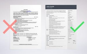
Minimalist – This is certainly an homage to the more standard templates that your parents might have used when they were creating resumes. The content is short and sweet, and there are very few design elements, other than a few clean lines and bullet points or symbols separating sections. Here’s a great comparison of what an older template vs a modern, simplistic template looks like:

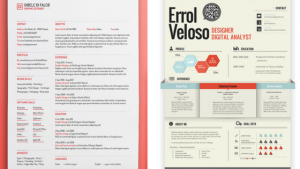
Color and Symbols – As I mentioned above, resumes aren’t so black and white anymore. Color is no longer seen as unprofessional or as a distraction in design. In the same vein, there are great symbols available in many design packages that will help you to add a cohesive design element throughout. Of course, although you can use color and symbols, it should always be used appropriately. If you’re in a field where graphic design is one of the main focuses of the job, showing off your design skills can start with the resume, and can be really unique. If you’re moving towards a more established position, such as a CEO or CFO, you’d likely want to stick to one accent color and minimal use of symbols. Here are two examples of colorful resumes: one that would work well in a professional setting and one for a more laid back setting:

Format – What many people may not know is that there are several different types of resume formats. Determining which one to use is very important, as choosing the wrong type could leave you looking a bit out of touch. The earliest resume format was known as the chronological resume, and it’s still used today. This was known as the global standard for quite some time, as it left nothing to the imagination – you listed all job experiences in the order in which you had them. Along the way, however, professionals started noticing that there may be another way to list jobs that would be more helpful. Thus, the functional resume was introduced. This format lists all relevant job experiences together, regardless of when you had the job. For anyone that could choose between the two? Well, just combine the formats! This type of resume is called a combination resume.
Once you start getting past the traditional formatting of resumes, there are other types that you can use as well. These are more graphic-design-leaning templates such as infographic resumes and video resumes.
Length – The length of your resume really depends on where you are applying and how much you need to convey. Of course, every resume will have a cover letter, so don’t forget that if you’re going past one page of a resume, you’ll want to make sure you have them labeled, ordered, or numbered correctly. In 2017, it’s much less taboo to have a multi-page resume. However, keep in mind that every job recruiter has hundreds of resumes to file through before they get to yours. If you’re going to take that extra step to put your resume on two pages, make sure that the second or third pages are truly supplemental to the content on your first page.
So far we’ve only scratched the surface! Stay tuned for part 2 of the resume building portion of my branding series, where I discuss what type of content should be included on your resume.
